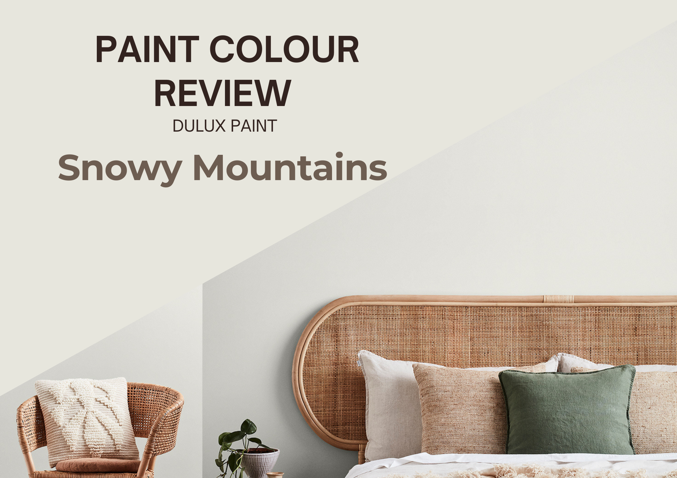
Dulux Snowy Mountains - Paint Colour Review
Finding the perfect white paint colour can seem daunting and overwhelming—there are so many options, and they all have different undertones! If you’re looking for a fresh, modern white that isn’t too stark or too creamy, Dulux Snowy Mountains might just be the one for you. It’s crisp yet soft, making it a fantastic choice for various spaces.
In this post, we’ll talk about its undertones, LRV (how light or dark it looks), and how it changes in different lighting. I’ll also share the best white trim colours and coordinating shades to help you decide if Snowy Mountains is the right fit for your home. Let’s dive in!
What are the undertones of Snowy Mountains?
At first glance, Dulux Snowy Mountains looks like a clean, crisp white, but like all whites, it has subtle undertones that can influence how it appears in different spaces. It has a very subtle warmth, making it a great alternative to cooler, stark whites. However, it doesn’t have strong creamy or yellow undertones, so it still feels fresh and modern. It’s an excellent white to consider if you want to add warmth to your space without any yellow tones.
Its undertone is a soft grey that helps it feel inviting while maintaining a neutral balance. This makes Snowy Mountains a fantastic choice for those who want a white that isn’t too cool or too warm—it sits comfortably in the middle.
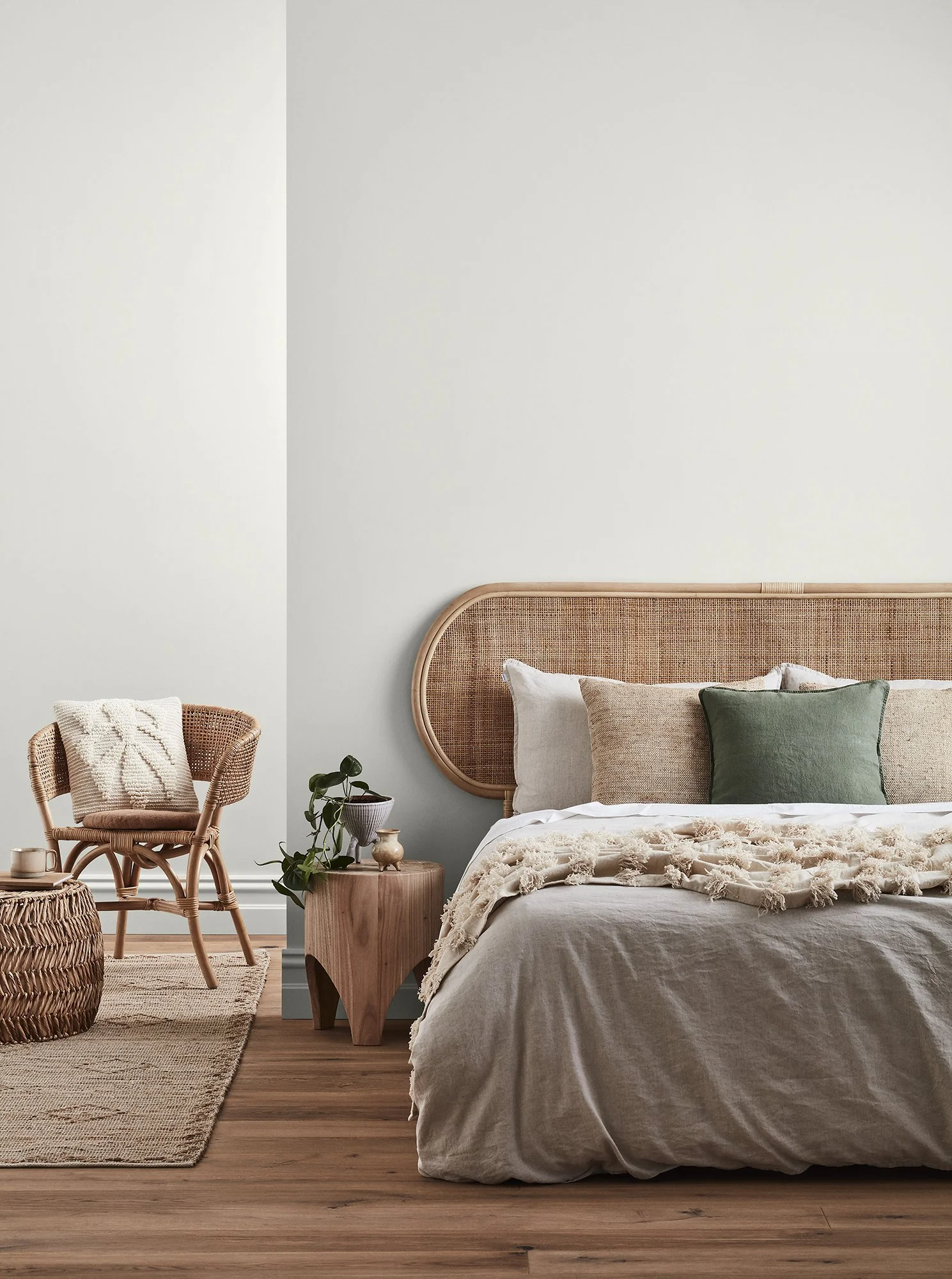
Photo via dulux.com.au
Snowy Mountains’ LRV
LRV (or Light Reflectance Value) helps determine how much light is absorbed or reflected by a paint colour. It is measured on a scale from 0 to 100, 0 being absolute black and absorbing all light, and 100 being pure white and reflecting all light. The higher the LRV, the lighter and brighter the paint colour. The LRV of a paint colour is an important factor to consider, especially if you're concerned about brightness or creating a specific ambience. Colours with higher LRVs tend to make a room feel brighter and more spacious, while colours with lower LRVs can create a more intimate or cosy atmosphere.
Snowy Mountains has an LRV of 81, making it a bright, airy white that reflects plenty of light. It’s a great choice if you want a fresh, open feel without using a stark, ultra-bright white. In rooms with lots of natural light, it will appear crisp and clean while maintaining a soft, subtly warm look; whereas in low-light spaces, its muted undertones may become more noticeable, giving it a cooler, slightly shadowed appearance. Because Snowy Mountains sits in a high-LRV range, it is excellent for making spaces feel larger and more open, while still offering a hint of depth compared to brighter whites.
How does Snowy Mountains look in different lighting conditions?
Lighting greatly impacts how a paint colour is perceived within a space, whether it be natural or artificial light. Natural light varies throughout the day making colours look slightly different in the morning and the evening, which is why it’s essential to use samples before fully committing to a paint colour so you can see how colours look at various times of the day and you can decide if a paint colour is the right one for your space.
North-facing rooms that tend to receive cooler, indirect natural light throughout the day can bring out the soft grey undertones in Snowy Mountains, making it feel a little cooler or more subdued.
South-facing rooms that receive plenty of warm, golden light, enhance the soft warmth in Snowy Mountains. In these spaces, it will appear brighter and slightly creamier, but it will never look overall creamy or yellow.
In west-facing rooms where the light is cooler in the morning and warmer in the afternoon, Snowy Mountains can lean more towards its crisper, greyer side early in the day. However, as the sun moves, this white will soften and warm up under artificial or indirect afternoon light.
In east-facing rooms where the light is more golden in the morning and cooler in the afternoon, Snowy Mountains may look a little cooler and more neutral later in the day, when the light is more indirect.
Regarding artificial lighting, warm white light bulbs will enhance the softness of Snowy Mountains, making it feel more inviting and balanced, while cool white bulbs may bring out its grey undertones, making it feel more neutral and modern.
Where is Snowy Mountains best used?
Thanks to its crisp yet soft feel, Dulux Snowy Mountains is a versatile white that works beautifully in a range of spaces. Whether you want a fresh, modern backdrop or a neutral white to complement other colours, this shade can do it all. It is a great white for walls, trims, and ceilings offering a bright and airy feel without being too stark. Its subtle undertones keep it from feeling too clinical.
In a kitchen, it works beautifully as a wall colour to keep the space light and fresh or as a cabinet colour for a soft, modern touch. It pairs well with warm wood tones, stone benchtops, and matte black or brass hardware.
In bathrooms, Snowy Mountains can contrast nicely with white tiles and create a soft, spa-like feel. Just be mindful that in rooms with limited natural light, it may lean slightly cooler.
Snowy Mountains can also be a fantastic exterior colour, especially when paired with warmer greys, soft beiges, or natural elements. However, like most whites, it can appear much brighter in direct sunlight, so testing a sample outside is essential.
This colour is incredibly flexible and suits modern, coastal, and even contemporary farmhouse-style homes. Whether you’re after a fresh, timeless white or a soft neutral with depth, Snowy Mountains is a fantastic choice!
What about trim colours?

Since Snowy Mountains has a subtle grey undertone, you’ll want a trim white that either blends seamlessly or creates a crisp contrast. A first option is to use Snowy Mountains as well, simply in a different sheen, to create a cohesive and harmonious look. For more contrast, consider:
Dulux Lexicon Quarter, a brighter, slightly cooler white to enhance the tones of Snowy Mountains;
Dulux Vivid White, a pure, bright white that will make Snowy Mountains stand out;
Dulux Natural White for a warmer, softer contrast.
If you're unsure which white is best for your space, testing samples next to Snowy Mountains under different lighting conditions will help you choose the best match!
Which colours coordinate best with Snowy Mountains?

Dulux Snowy Mountains is a versatile soft white that pairs easily with a range of colours. Here are some of the best coordinating colours to consider:
If you want a harmonious, layered look, pairing Snowy Mountains with soft greiges and warm neutrals creates a calm and inviting feel: consider colours like Dulux White Duck or Beige Royal Quarter.
For a more grounded, inviting look, pairing this soft white with warm and earthy hues can add depth and character: consider paint colours such as Dulux Jarrah or Hog Bristle Quarter for a soft, cosy feel.
If you prefer a cooler, more contemporary feel, pairing Snowy Mountains with deeper greys can create contrast and a sleek aesthetic: consider colours like Dulux Domino or Timeless Grey.
Adding soft greens and blues can bring a fresh, calming feel while complementing the crispness of Snowy Mountains: consider tones such as Dulux Spanish Olive or Duck Egg Blue for a serene atmosphere.
These coordinating colours allow you to create a variety of moods, from warm and inviting to cool and modern, depending on your style. No matter which direction you choose, Snowy Mountains provides a beautiful, adaptable backdrop for your home!
———————
Dulux Snowy Mountains is a beautifully soft, neutral white that works effortlessly in a variety of spaces. Whether you use it on walls, trim, cabinetry, or exteriors, this versatile white adapts to different lighting conditions and pairs well with a range of colours, from warm neutrals to cool greys and nature-inspired tones.
If you need more help picking the right paint colours for your home, I can help!
Need expert colour advice tailored to your home? Check out my custom colour consultation services, where I help you choose the perfect palette to suit your space.
Looking for a ready-made whole house colour palette to make decorating easier? Browse my curated digital colour palettes featuring beautiful, timeless combinations that work seamlessly together.
Choosing the right paint colours can be overwhelming, but you don’t have to do it alone! If you have any questions about Dulux Snowy Mountains or need help finding the perfect coordinating colours, feel free to reach out—I’d love to help.
Thank you for reading and happy decorating,
Manon xx