Our 5 Favourite Whites From Benjamin Moore

In interior design, white paint represents endless possibilities, versatility, and timeless elegance. It is the perfect backdrop to build any aesthetic, from classic to contemporary and everything in between. Use it to enhance natural light, enlarge rooms, and create a sense of space and serenity. Whether you’re looking to brighten up a cosy nook or transform an entire home, white paint is the ideal colour to allow your decor and personal style to take centre stage.
However, choosing the perfect paint for your interior can be overwhelming and stressful. Undertones, lighting conditions, and surrounding elements all need to be considered when selecting a white paint colour.
Benjamin Moore offers a wide variety of options to consider, each shade carrying its own personality and character. From crisp, clean whites to warm, creamy hues, let’s discover our 5 favourite white paints from Benjamin Moore.
White Dove

Image via Heavenly - Hideaway
White Dove is one of Benjamin Moore’s most popular shades of white. It is known and appreciated for its softness and warmth thanks to yellow undertones, making it a go-to choice for walls, trims, ceilings, and even cabinets.
White Dove is a very versatile colour option that works well in various design styles, from contemporary and classic to Scandinavian and coastal. It also pairs beautifully with many other shades such as navy blue, green, greige, brown, or grey. It is a widely used paint colour in interior design and an ideal choice for those looking to add brightness and warmth to their space.
It has an LRV (Light Reflectance Value) of 83 out of 100, meaning that White Dove reflects enough light to brighten up a space and give it a fresh new look. Its yellow undertones will warm up a north-facing room and look bright and balanced under a southern or western afternoon light. If you want more information about White Dove, its coordinating colours, and where to use it, read the entire blog post here.
Chantilly Lace

Photo via Making Home Pretty
Chantilly Lace is another popular versatile white from Benjamin Moore. Unlike White Dove, it is a clean, crisp white with barely any undertones. It can pick up a veeeeery slight cool blue undertone, but it stays a bright clean white, making it a popular option for walls, trims, and ceilings.
It has an LRV (Light Reflectance Value) of 90 meaning it’s a pretty crisp white that will reflect a lot of light, ideal to make a space look bigger and brighter and give it a clean look. With barely any undertones, it’s a rather safe white that you can easily pair with other colours and use in your dream interior aesthetic.
Chantilly Lace is ideally used on trims to create a striking contrast with other colours without worrying about mixing undertones. If applied on walls, I would highly recommend using it on trims as well as its high LRV means it won’t pair well with other whites. While you can’t really go wrong with Chantilly Lace, it might not be the best option if you want to add depth or warmth to your space.
Cloud White

Photo via Julie Blanner
Cloud White is a beautiful warm white with soft yellow undertones. It’s another go-to white paint colour from Benjamin Moore, appreciated for its softness and warmth.
It has an LRV (Light Reflectance Value) of 85 meaning it’s not as crisp as Chantilly Lace, but it is slightly brighter than White Dove. In a north-facing room or afternoon eastern light, Cloud White is great to balance out the cool tones and bring some warmth. Whereas in a south-facing or afternoon western light, its yellow undertones become more visible and it will look like a creamier white.
Just like White Dove, Cloud White is a popular option for walls, trims, and cabinets thanks to its bright soft look. If you use Cloud White on your walls, I recommend you use it on the trims as well. This way, you can create a unified look that will make your space look bigger and brighter. Using a crisper white on the trims will enhance Cloud White’s yellow tones and make it look like a creamy almost off-white paint colour. If that’s the look you’re looking for, then your best option for trims would be a crisp white like Chantilly Lace, with barely any undertones.
Decorator’s White
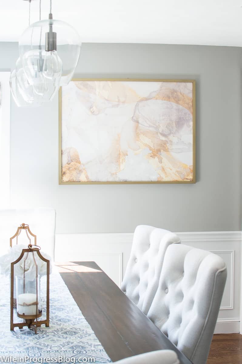
Photo via Jenna Kate At Home
Decorator’s White is a cool white with grey and blue undertones. While it’s not the most popular white because of its cool tones, it’s worth considering and having a look at.
It has an LRV (Light Reflectance Value) of 82 which means it’s not as white as the other white paint colours we previously talked about. A north-facing or afternoon eastern light will enhance Decorator’s White’s undertones and make it look even cooler, whereas a south-facing or afternoon western light will make it look a bit softer and more balanced.
Decorator’s White can be used on walls, cabinets, and trims, however, you need to use it with precaution because of its cool undertones. If used on walls, it’s best to use it on the trims as well to avoid mixing the wrong undertones and to have a space that looks consistent and unified. If you want to highlight the tones of Decorator’s White, you will have to use a very clean and crisp white on your trims, such as Chantilly Lace or High Reflective White SW 7757 from Sherwin Williams.
The grey and blue undertones of Decorator’s White are best paired with other cool tones like a cool grey with blue undertones or a cool blue paint colour.
White Heron

Photo via Benjamin Moore
White Heron (also known as Oxford White CC-30) is a soft white with subtle yellow undertones giving it its warmth. It’s another popular option if you’re looking for a bright white with a very subtle warm touch.
It has an LRV (Light Reflectance Value) of 86 which means it’s a brighter white than White Dove but not as crisp as Chantilly Lace. A south-facing or afternoon western light will enhance White Heron’s undertones and make it look slightly warmer. In a north-facing or cool light, it might look like a more neutral light.
White Heron is mostly used on walls, trims, and ceilings. If used on walls, it’s recommended to use it on trims as well to avoid mixing up undertones.
—————————
Not seeing a white you like? Read this article about our favourite white paint colours from Sherwin Williams.
With so many undertones and surrounding elements that come into play, choosing the right white paint colour is no easy task. Sampling is one of the easiest ways to see if a paint colour is right for your space. Research paint colours, get samples of your favourite shades, and apply them on different walls to see how each colour reacts with light, furnishings, and outside elements.
Still struggling to find the right paint colour for your space? Have a look at my custom colour service or get in touch to see how I can help you transform your home.
Thank you for reading and happy decorating,
Manon xx