Paint Colour Review: Sea Salt SW 6204 by Sherwin Williams

If you’re looking for a soft, calming paint colour that brings a hint of coastal charm to your space, Sea Salt SW 6204 by Sherwin Williams might just be the colour you’ve been looking for. This gorgeous muted green is loved for its softness, versatility, and timeless elegance. But is Sea Salt the right colour for your home? In this post, we’ll explore its undertones, LRV (Light Reflectance Value), and how it appears in different lighting conditions. Plus, I’ll share the best white trim colours to pair with it, coordinating colours for a cohesive look, and the rooms where it truly shines. Whether you're considering it for a bathroom, bedroom, or whole-house colour, this guide will help you decide if Sea Salt is your perfect match!
What are the undertones of Sea Salt?
One of the reasons Sea Salt is such a popular paint colour is its beautiful blend of green, blue, and grey undertones. While it's technically a soft green, it has a unique way of shifting depending on the lighting and surroundings, as we’ll see later. Sea Salt is the perfect tone to create a space that feels ultimately relaxing, serene, and calming with an elegant and fresh soft coastal touch.
Photovia thehouseofhoodblog.com
What is the LRV of Sea Salt?
LRV (or Light Reflectance Value) helps determine how much light is absorbed or reflected by a paint colour. It is measured on a scale from 0 to 100, 0 being absolute black and absorbing all light, and 100 being pure white and reflecting all light. The higher the LRV, the lighter and brighter the paint colour. The LRV of a paint colour is an important factor to consider, especially if you're concerned about brightness or creating a specific ambience. Colours with higher LRVs tend to make a room feel brighter and more spacious, while colours with lower LRVs can create a more intimate or cosy atmosphere.
Sea Salt has a Light Reflectance Value of 63 which puts it right in the middle of the range - it is light enough to make your space feel airy and open, but also has enough depth and colour to add character. What does this mean for your space? In rooms with lots of natural light, Sea Salt will feel soft and airy, reflecting a good amount of light without being too washed out. While in darker rooms or spaces with limited natural light, it may appear slightly more muted, with its grey undertones becoming more noticeable.
LOVE THIS TONE? GET THE PERFECT COORDINATING COLOURS IN MY WHOLE-HOUSE PAINT PALETTE - INSTANTLY DOWNLOADABLE AND EXPERTLY CURATED!

Want a professionally designed home colour scheme? My Whole-House Colour Palette pairs Sea Salt with harmonious neutrals and accent shades for a seamless, stylish home. Get yours now!
Why you will love it:
Eliminates the guesswork – No more struggling to find the right coordinating colours. The palette is professionally curated to ensure a cohesive look, saving you time and reducing overwhelm.
Perfectly coordinated colours – Includes expertly chosen neutrals, accent colours, and trim options that pair beautifully with Sea Salt to create a seamless, designer-approved home.
Versatile & timeless – Designed to suit various styles, lighting conditions, and home aesthetics, making it a smart long-term choice.
Instant digital download – Get immediate access to your curated palette and start planning your home’s perfect colour scheme today!
How does Sea Salt look in different lighting conditions?
Lighting greatly impacts how a paint colour is perceived within a space, whether it be natural or artificial light. Natural light varies throughout the day making colours look slightly different in the morning and the evening, which is why it’s essential to use samples before fully committing to a paint colour so you can see how colours look at various times of the day and you can decide if a paint colour is the right one for your space.
Sea Salt truly shines in bright, sunlit rooms! It will lean more towards its blue-green tones, giving it a fresh and airy coastal feel. If your space gets a lot of natural light, expect it to feel light and refreshing. In north-facing rooms or afternoon eastern light (cool, bluish light), Sea Salt may appear a bit more subdued and take on a soft, muted grey-green tone; while in south-facing rooms or afternoon western light (warm, golden light), it will feel brighter and slightly greener as the warmth of the light balances out the cooler blue undertones.
Where to best use Sea Salt in the house?
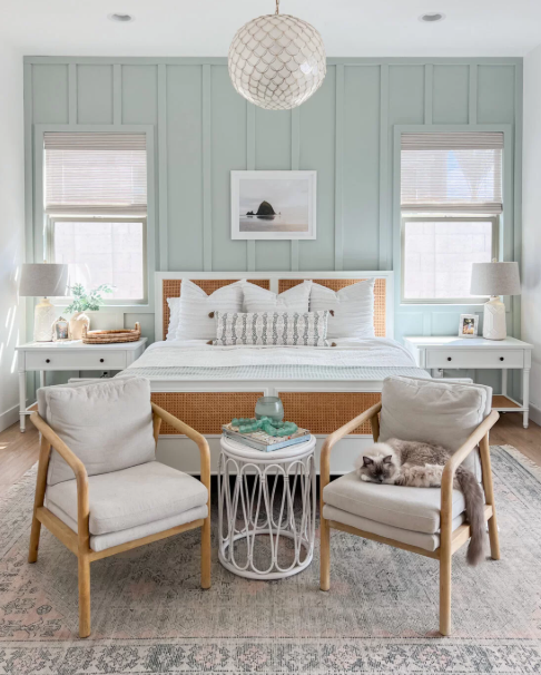
Sea Salt’s soft, serene vibe makes it a perfect choice for a variety of spaces, especially if you love a light and airy feel. In a bathroom, it has a spa-like quality that makes it a favourite for creating a calm, refreshing atmosphere. It pairs beautifully with white tiles, natural stone, and soft neutrals. In a bedroom, Sea Salt’s soft green-blue tones is ideal if you want a peaceful, restful retreat with a relaxing, tranquil feel that’s perfect for winding down. In living rooms, it will feel light, fresh, and inviting without overwhelming the room. In a kitchen, whether on walls, cabinets, or even an island, Sea Salt works wonderfully with white, wood, and warm metallics like brass or brushed nickel.
Thanks to its versatility, Sea Salt can work in almost any space - especially if you love a light and airy aesthetic.
Best white trim colours with Sea Salt

Pairing Sea Salt with the right white trim colour can enhance its soft, airy feel and make it look even more polished. Here are some of my favourite white paint colours to pair it with:
Sherwin Williams Pure White (SW 7005) for a subtle contrast that feels inviting.
Sherwin Williams Extra White (SW 7006) to make Sea Salt look a little fresher and more modern, with a sharp, bright contrast.
Sherwin Williams Alabaster (SW 7008) for a softer, slightly cosier look.
Benjamin Moore Chantilly Lace (OC-65), a bright white to keep things feeling fresh and airy.
What about coordinating colours?

Sea Salt is a versatile colour that pairs beautifully with a variety of shades, whether you’re going for a soft, coastal vibe or a more sophisticated, neutral palette. Here are some of the best coordinating colours to complement Sea Salt:
Muted beiges and soft whites for a warm, cosy, organic look - Sherwin Williams Accessible Beige (SW 7036).
Soft blues and muted greens for a fresh, serene, and relaxing palette - Sherwin Williams Comfort Gray (SW 6205), Sherwin Williams Retreat (6207).
Dark greys or deep navy blues more contrasts that add drama and sophistication - Sherwin Williams Urbane Bronze (SW 7048), Sherwin Williams Naval (SW 6244).
These colours all work well with Sea Salt, depending on whether you want a soft and soothing feel or a bold and striking contrast. No matter your style, Sea Salt’s versatility makes it easy to create a cohesive and timeless colour palette!
———————
Sea Salt by Sherwin Williams is a beautifully soft colour that brings a touch of serenity to any space. Whether you use it in a bathroom, bedroom, living room, or even kitchen, its ability to shift between green, blue, and grey makes it a versatile and timeless choice. Paired with the right white trim and coordinating colours, Sea Salt can help create a cohesive, calming, and stylish home.
Not sure how to pull together the perfect whole-home palette, I’ve got you covered! I offer ready-to-go whole-house colour palettes and custom colour services to help you create a beautiful, harmonious look with ease.
Thank you for reading and happy decorating!
Manon xx