Paint Colour Review: Kendall Charcoal by Benjamin Moore

Kendall Charcoal by Benjamin Moore is another one of my favourite dark paint colours. It’s a sophisticated and versatile dark grey that has become a favourite in interior decorating. With its rich, deep hue, this colour effortlessly combines elegance and modernity, making it an ideal choice for creating a striking focal point or a cozy, enveloping atmosphere. Its balanced undertones of green and slightly brown bring warmth and depth, ensuring it complements a variety of styles and colour palettes. Whether used in living rooms, bedrooms, or as an accent wall, Kendall Charcoal brings a touch of drama, timeless elegance, and a contemporary touch to any space.
In this review, we learn more about Kendall Charcoal, its Light Reflectance Value (LRV), how it performs under different lighting conditions, where to best use it in your home, as well as ideal trim colours and coordinating colours.
Keep reading to find out if Kendall Charcoal is the right shade of deep grey for you.
Kendall Charcoal’s LRV
LRV (or Light Reflectance Value) helps determine how much light is absorbed or reflected by a paint colour. It is measured on a scale from 0% to 100%, 0% being absolute black and absorbing all light, and 100% being pure white and reflecting all light. The higher the LRV, the lighter and brighter the paint colour. The LRV of a paint colour is an important factor to consider, especially if you're concerned about brightness or creating a specific ambience. Colours with higher LRVs tend to make a room feel brighter and more spacious, while colours with lower LRVs can create a more intimate or cosy atmosphere.
Kendall Charcoal has an LRV of 14.61 which means it’s a dark grey that absorbs more light than it reflects, creating an intimate and dramatic atmosphere. It has absolutely gorgeous tones with quite passive green and very slightly brown undertones which means it usually acts as a neutral grey. It is a beautiful colour to add warmth, depth, and character to any space.

Photo via Pinterest
Kendall Charcoal in different lighting conditions
Lighting greatly impacts how a paint colour is perceived within a space, whether it be natural or artificial light. Natural light varies throughout the day making colours look slightly different in the morning and the evening, which is why it’s essential to use samples before fully committing to a paint colour so you can see how colours look at various times of the day and you can decide if a paint colour is the right one for your space.
In a room filled with natural light, Kendall Charcoal will show all its beautiful tones, becoming an ideal accent colour. Imagine it in a bright kitchen, on a kitchen island paired with warm white kitchen cabinets. It can create an elegant, inviting, and sophisticated look. In a cool light such as in a north-facing room or afternoon eastern light, Kendall Charcoal will lean considerably more into its grey tones and look almost as a true dark grey with a very subtle warmth. It will still provide enough warmth to balance out the cool light and won’t look like an icy cold grey. In a warm light such as in a south-facing room or afternoon western light, it will look slightly warmer while still keeping a grey tone. One way to make Kendall Charcoal look warmer is to pair it with another cool tone.
In a dimly lit room or under an evening light, Kendall Charcoal will look darker and deeper, taking on a more enveloping appearance. It will create a dramatic, moody, and elegant look.
Where can I use Kendall Charcoal?

Photo via Luxe Source
Living Room
Kendall Charcoal is perfect for creating a sophisticated and inviting living room. Use it on an accent wall to ground the space and pair it with lighter, neutral tones like warm white or beige for a balanced look. This deep grey can make any artwork and decor stand out, adding a touch of elegance to the room. For added elegance, consider using Kendall Charcoal on built-in shelves or cabinetry as well.
Kitchen
In the kitchen, Kendall Charcoal can be used on lower cabinets or an island to add a sense of depth and contrast. Pair it with white upper cabinets and a light backsplash to keep the kitchen looking open and airy. Kendall Charcoal pairs beautifully with marble or quartz countertops, and brass hardware, enhancing the luxurious feel of the kitchen.
Bedroom
Create a cozy and restful retreat by using Kendall Charcoal on the walls of a bedroom. Its deep, soothing colour promotes relaxation and serenity. It works exceptionally well in a bedroom with plenty of natural light, where it can add a dramatic, yet calming, atmosphere. For even more drama, think about colour-drenching your room, which means painting walls, trims, and ceilings the same colour.
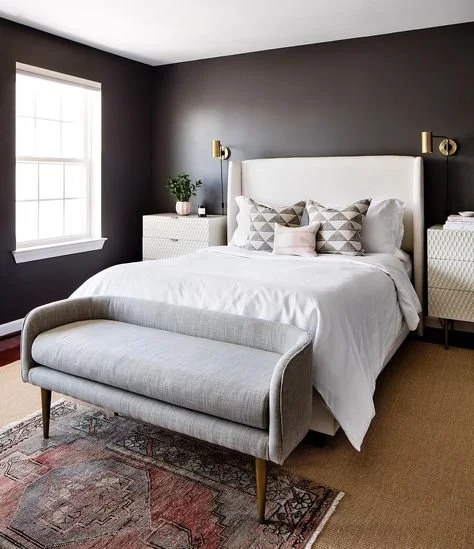
Photo by Interiors by Color
Bathroom
For a chic and modern bathroom, consider Kendall Charcoal on the walls or vanity. Its dark, rich tone provides a striking contrast to white fixtures and tiles. Use metallic accents, such as chrome or brushed nickel, to add a touch of modernity. Kendall Charcoal also pairs well with natural materials like wood and stone, creating a spa-like environment.
Home Office
In a home office, Kendall Charcoal can create a focused and sophisticated workspace. Use it on all four walls to create a cozy, enveloping atmosphere, or limit it to an accent wall behind the desk for a bold statement. Pair it with lighter furniture and accessories to ensure the space remains bright and enhances productivity and creativity.
Exterior
Kendall Charcoal is an excellent choice for a home's exterior, offering a timeless and elegant look. It works beautifully on siding, shutters, and front doors. Pair it with crisp white trim for a classic, clean look, or with natural wood accents for a more rustic appeal.
What about white trim colours?

Kendall Charcoal complements a wide range of white paint colours for trims to create contrast. Here are my favourite ones to consider:
Chantilly Lace (OC-65)
Chantilly Lace is a pure, clean white that pairs beautifully with Kendall Charcoal. Its high LRV (Light Reflectance Value) ensures it reflects plenty of light, creating a sharp contrast that highlights the gorgeous tones of Kendall Charcoal.
Simply White (OC-117)
Simply White is a warm white with very subtle yellow undertones, making it a versatile option for trim. Its warmth complements the deep tones of Kendall Charcoal without appearing too stark. Simply White provides a soft, welcoming contrast, perfect for creating a cozy yet elegant atmosphere in any room.
White Dove (OC-17)
White Dove is a soft, warm muted white with subtle yellow undertones, making it an excellent choice for pairing with Kendall Charcoal. Its warmth ensures a soft contrast with the deep grey, creating a classic and sophisticated look.
Decorator's White (OC-149)
Decorator's White is a bright white with subtle grey and blue undertones, providing a balanced and versatile option for trim. It offers a fresh and refined look, ensuring the trim stands out without overpowering the overall aesthetic. Its undertones pair beautifully with the grey tones of Kendall Charcoal for a modern and classic look.
Alabaster (SW 7008)
Alabaster (read the full review) is a soft, warm white that provides a soft contrast to the deep tones of Kendall Charcoal. Its warmth ensures the overall look feels cohesive and inviting.
What coordinating colours work best with Kendall Charcoal?

Kendall Charcoal is quite versatile and pairs well with a variety of colours.
Consider a beige or greige with green undertones like Revere Pewter (HC-172), Manchester Tan (HC-81), Edgecomb Gray (HC-173), Accessible Beige (SW7036).
Warm whites like White Dove (OC-17) or Simply White (OC-117).
A light grey like Stonington Gray (HC-170) for a modern look.
A light blue-grey such as Palladian Blue (HC-144).
A muted terracotta like Terra Mauve (105).
Colours similar to Kendall Charcoal
Iron Mountain 2134-30

Iron Mountain is a dark, warm grey with a hint of brown undertone, very similar to Kendall Charcoal. Its undertones make it warmer and slightly darker than Kendall Charcoal.
Amherst Gray (HC-167)

Amherst Gray is a deep, cool grey, slightly lighter than Kendall Charcoal. It has subtle green undertones making it subtly cooler, offering a slightly different take on dark grey compared to Kendall Charcoal.
Urbane Bronze SW7048

Urbane Bronze by Sherwin Williams is slightly darker than Kendall Charcoal with more brown undertones making it look warmer as well.
—————————
Overall, Kendall Charcoal is a beautiful warm dark grey that will add depth, character, and drama to your interior.
Not sure about Kendall Charcoal? Have a look at my whole house colour palettes! Ready to download, comprehensive, detailed, budget-friendly, and expertly put-together, you are one click away from transforming your home!
If you find choosing the right colour for your home too stressful and overwhelming, I also provide a Custom Interior Colour Palette service. I would love to make this process easier for you and help you create your dream home. And if you need more information about my services or simply want to get in touch with me, click here.
Thank you for reading and happy decorating,
Manon xx