Swiss Coffee OC-45 by Benjamin Moore - Paint Colour Review

If you’ve been searching for the perfect creamy white paint colour that feels warm, inviting, and effortlessly elegant, take a look at Swiss Coffee OC-45 by Benjamin Moore. This beloved white has become a favorite for its softness, warmth, and versatility without being overly yellow or creamy. It looks incredible in any space and is usually used as a main backdrop white throughout the house.
Today, we’ll dive into everything you need to know about Swiss Coffee: its undertones, LRV, how it behaves in different lighting conditions, and what trim and coordinating colours to pair it with. Whether you're considering it for your walls, kitchen cabinets, or an entire home palette, this guide will help you decide if Swiss Coffee is the right choice for your space.
What colour is Swiss Coffee?

Swiss Coffee is a warm, creamy white with soft yellow (almost beige) and just a hint of green undertones helping tone down the warmth. These subtle undertones give it that cosy, welcoming feel without making it look overly yellow or creamy. It's what makes Swiss Coffee such a popular choice for those wanting a white that's not stark or cold. If you're looking for a white that adds a touch of softness and comfort, but still reads fresh and elegant, Swiss Coffee’s undertones might be just what you’re after.
Because of its warmth, Swiss Coffee pairs beautifully with natural materials like wood and stone, and it works especially well in homes with warm lighting or lots of natural sunlight. However, it can shift slightly depending on your space. which we’ll get to later.
What is Swiss Coffee’s LRV?
LRV (or Light Reflectance Value) helps determine how much light is absorbed or reflected by a paint colour. It is measured on a scale from 0 to 100, 0 being absolute black and absorbing all light, and 100 being pure white and reflecting all light. The higher the LRV, the lighter and brighter the paint colour. The LRV of a paint colour is an important factor to consider, especially if you're concerned about brightness or creating a specific ambience. Colours with higher LRVs tend to make a room feel brighter and more spacious, while colours with lower LRVs can create a more intimate or cosy atmosphere.
Swiss Coffee has an LRV of 81.91, which means it’s a rather bright white, edging on the off-white range, that will reflect a good amount of natural and artificial light. It can help make a room feel more spacious and open, especially in spaces with limited natural light. However, it’s definitely not a true white - put it next to a crisper white like Chantilly Lace OC-65 or Simply White OC-117 and you will see its soft and creamy tones become more apparent, making it feel warmer and more grounded.
LOVE THIS TONE? GET THE PERFECT COORDINATING COLOURS IN MY WHOLE-HOUSE PAINT PALETTE - INSTANTLY DOWNLOADABLE AND EXPERTLY CURATED!

Want a professionally designed home colour scheme? My Whole-House Colour Palette pairs Swiss Coffee with harmonious neutrals and accent shades for a seamless, stylish home. Get yours now!
Why you will love it:
Eliminates the guesswork – No more struggling to find the right coordinating colours. The palette is professionally curated to ensure a cohesive look, saving you time and reducing overwhelm.
Perfectly coordinated colours – Includes expertly chosen neutrals, accent colours, and trim options that pair beautifully with Swiss Coffee to create a seamless, designer-approved home.
Versatile & timeless – Designed to suit various styles, lighting conditions, and home aesthetics, making it a smart long-term choice.
Instant digital download – Get immediate access to your curated palette and start planning your home’s perfect colour scheme today!
How does Swiss Coffee look in different lighting conditions?
Lighting greatly impacts how a paint colour is perceived within a space, whether it be natural or artificial light. Natural light varies throughout the day making colours look slightly different in the morning and the evening, which is why it’s essential to use samples before fully committing to a paint colour so you can see how colours look at various times of the day and you can decide if a paint colour is the right one for your space.
In north-facing rooms, which tend to bring cooler, buish light throughout the day, Swiss Coffee can appear a bit more muted and subdued. Thanks to its soft yellow undertones, it can beautifully balance out the cool light and make it look more like a soft, creamy neutral rather than obviously warm.
In south-facing rooms, which get warmer, golden light, Swiss Coffee’s warm undertones become more noticeable. It can feel extra cosy and inviting, perfect for living rooms, bedrooms, or spaces where you want a soft, sun-kissed look.
In east-facing rooms, you’ll see the warmest version of Swiss Coffee in the morning when the light is soft and golden. But, as the sun moves and fades, it may cool slightly and appear more neutral in the evening or afternoon.
In west-facing rooms, which tend to get cooler light in the morning and bring a warm glow in the afternoon, Swiss Coffee will appear creamy and cosy, almost like a pale, muted beige, later on in the day.
Nothing beats natural light, but if you have a dimly lit space, it’s a good idea to add sources of artificial light to help reveal all the beautiful tones of Swiss Coffee. Warm white bulbs will enhance its creamy, cosy feel, while cooler light bulbs might wash it out or make it appear less warm.
Best trim colour with Swiss Coffee

Being a rather bright white, the ideal trim colour to use with Swiss Coffee is Swiss Coffee itself. For a seamless, soft look, use it on both walls and trim. Simply use a different sheen, like eggshell on the walls and semi-gloss on the trim, to create a subtle contrast through texture rather than colour. This approach works especially well for a clean, minimalist, and cohesive look.
If you’d like a bit more contrast and bring out the tones of Swiss Coffee, consider a crisper white. The first option is Chantilly Lace OC-65 - a bright, neutral white with minimal undertones, so it won’t clash with the warmth of Swiss Coffee. It can give your space a more polished, classic feel-ideal for transitional or contemporary interiors. A second option is Simply White OC-117 - another bright white but with a subtle touch of warmth that complements Swiss Coffee nicely without being too creamy. It’s perfect if you want the trim to stand out slightly while maintaining a warm and cohesive look.
No matter which trim color you choose, always sample them together on-site. Lighting, flooring, and even nearby furnishings can affect how whites play off each other in your space.
What about coordinating paint colours?
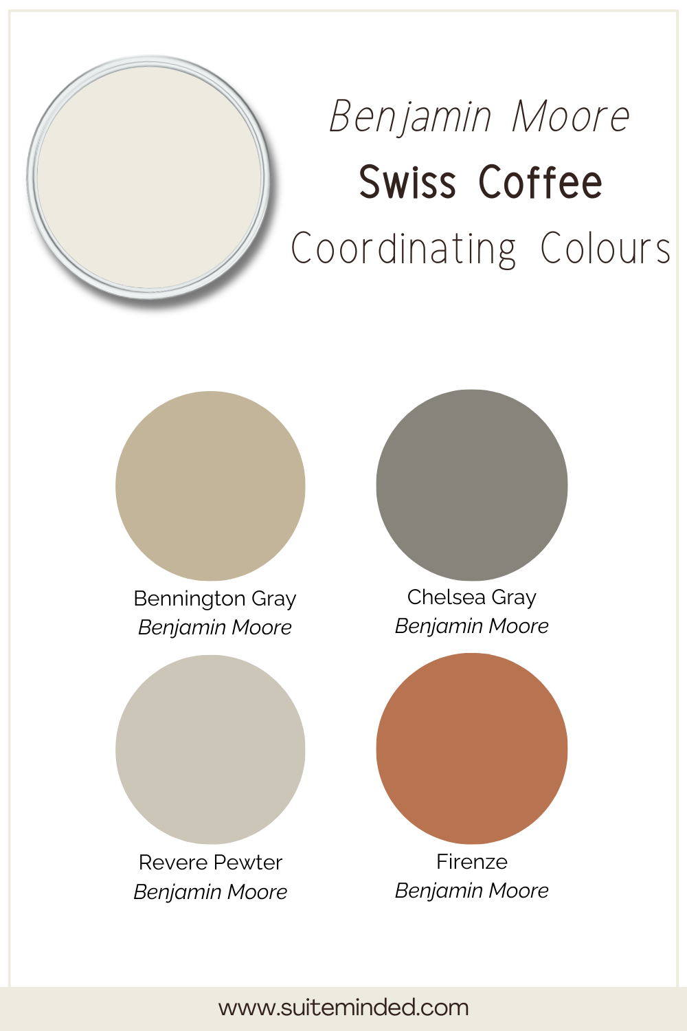
Swiss Coffee is an incredibly versatile shade thanks to its soft, creamy warmth. It pairs beautifully with a wide range of colours, from earthy neutrals to rich, moody tones. Whether you're building a full colour palette or just looking for accent tones, here are some of the best hues to coordinate with Swiss Coffee:
Warm neutrals: Pair Swiss Coffee with warm taupes, beiges, off-whites, and greiges for a soft, layered look. Think shades like Edgecomb Gray HC-83 or Revere Pewter HC-172—they share similar undertones and create a serene, harmonious palette.
Soft greens: Muted greens like October Mist 1495 offer a fresh, calming pairing with Swiss Coffee for a nature-inspired look.
Rich, earthy accents: For contrast and depth, try pairing Swiss Coffee with rich earthy tones like terra cotta, olive, or even a deep charcoal grey or navy blue like Chelsea Gray HC-168. These colours help ground the softness of Swiss Coffee and add a sophisticated edge and depth.
When building your color scheme, keep in mind your home’s natural light and finishes. Sampling is always key to finding that perfect combination!
——————
If you're drawn to soft, warm whites that feel timeless and versatile, Swiss Coffee OC-45 by Benjamin Moore is definitely worth considering. Its creamy undertones and easy pairing with other hues make it a great choice for everything from walls to cabinetry.
But remember—choosing the right paint colour goes beyond just loving how it looks online. Your lighting, home style, and surrounding finishes all play a role in how a colour will truly look and feel in your space. If you’re feeling overwhelmed or unsure about where to start, I’m here to help! I offer digital whole-house colour palettes that take the guesswork out of choosing coordinating colours, and I also offer custom colour consulting services tailored to your home and style. Get in touch if you need more information!
In the meantime, thank you for reading and happy decorating!
Manon xx