Paint Colour Review: Manchester Tan HC-81 by Benjamin Moore

Manchester Tan HC-81 by Benjamin Moore is a soft, earthy tan colour that has been a favourite for years, thanks to its ability to create a cosy yet sophisticated atmosphere. It is ideal if you’re looking for a timeless, warm neutral tone that brings effortless elegance to your home.
In this post, we’ll take a deep dive into Manchester Tan’s undertones, LRV (Light Reflectance Value), and how it reacts to different lighting conditions. We’ll also explore the best trim colours, coordinating shades, and ideal spaces to use this versatile hue. Whether you’re refreshing your walls, choosing colours for a whole-house palette, or just curious about this classic shade, this guide will help you decide if Manchester Tan is the right fit for your home.
What are the undertones of Manchester Tan?

Manchester Tan HC-81 by Benjamin Moore
At first glance, Manchester Tan appears to be a classic tan, but there’s more to this colour than meets the eye. It is definitely on the warm side, but it’s not overly golden or yellow like some traditional neutrals. Instead, it has a soft, muted warmth that gives it an elegant and timeless feel. The undertones in Manchester Tan are what makes it so versatile. It has a slight green undertone, which keeps it from feeling overly warm and gives it a more natural, grounded look.
Manchester Tan’s LRV
LRV (or Light Reflectance Value) helps determine how much light is absorbed or reflected by a paint colour. It is measured on a scale from 0 to 100, 0 being absolute black and absorbing all light, and 100 being pure white and reflecting all light. The higher the LRV, the lighter and brighter the paint colour. The LRV of a paint colour is an important factor to consider, especially if you're concerned about brightness or creating a specific ambience. Colours with higher LRVs tend to make a room feel brighter and more spacious, while colours with lower LRVs can create a more intimate or cosy atmosphere.
Manchester Tan has an LRV of 63.24 which means it’s a medium tan colour - it reflects a decent amount of light but isn’t overly bright. It has enough depth to add warmth and contrast against white trim or cabinetry and looks best in spaces with moderate natural light to showcase its beautiful tones. In a darker room, Manchester Tan can sometimes look a bit too passive and dingy.
How does Manchester Tan look in different lighting conditions?
Lighting greatly impacts how a paint colour is perceived within a space, whether it be natural or artificial light. Natural light varies throughout the day making colours look slightly different in the morning and the evening, which is why it’s essential to use samples before fully committing to a paint colour so you can see how colours look at various times of the day and you can decide if a paint colour is the right one for your space.
In north-facing rooms that tend to have cooler, blue-tinted light throughout the day, Manchester Tan may lean slightly more muted and neutral, with its subtle green undertones becoming more noticeable. Instead of looking like a warm tan, it takes on a soft greige-like appearance, which can be a great choice if you want to add a soft neutral warmth to your space.

Manchester Tan entryway with White Dove trims
In south-facing rooms that get abundant warm, natural light throughout the day, Manchester Tan’s warmth is enhanced. In the conditions, this shade will appear lighter and more golden, without looking too yellow thanks to its green undertones. It will create a welcoming and cosy feel.
In east-facing rooms, Manchester Tan will look warm and golden in the morning when the sunlight is soft and warm. However, as the day progresses, it may take on a more neutral or slightly greige tone in the afternoon.
In west-facing rooms that tend to have duller, cooler light in the morning and rich, golden light in the afternoon and evening, Manchester Tan may feel more neutral early in the day but will warm up significantly in the afternoon, taking on a deeper, richer tan tone.
Where to best use Manchester Tan in your home?

Kitchen with Manchester Tan on walls and White Dove on trims
Thanks to its warm, neutral character and versatility, Manchester Tan works beautifully in a variety of spaces. In a living room, it is ideal if you want a warm, sophisticated look without it feeling too dark or heavy. It pairs beautifully with white trim and natural textures, making it perfect for traditional, transitional, or farmhouse-style spaces.
For a calm and cosy bedroom, Manchester Tan creates a soft, soothing atmosphere. It works well with neutral bedding, wood tones, and earthy accents. If you want a relaxed and inviting space, this colour is a great option.
In a kitchen space, Manchester Tan pairs well with wood cabinets, white trim, and natural stone countertops. It can bring warmth to the space without clashing with other elements, and it works especially well in farmhouse or classic kitchens.
Manchester Tan is also a great option if you're looking for a versatile neutral for hallways or an entryway. It provides just enough colour to add warmth and depth, without overwhelming the space. Plus, its versatility makes it easy to coordinate with different wall colours in adjacent rooms.
LOVE THIS TONE? GET THE PERFECT COORDINATING COLOURS IN MY WHOLE-HOUSE PAINT PALETTE - INSTANTLY DOWNLOADABLE AND EXPERTLY CURATED!
Want a professionally designed home colour scheme? My Whole-House Colour Palette pairs Manchester Tan with harmonious neutrals and accent shades for a seamless, stylish home. Get yours now!
Why you will love it:
Eliminates the guesswork – No more struggling to find the right coordinating colours. The palette is professionally curated to ensure a cohesive look, saving you time and reducing overwhelm.
Perfectly coordinated colours – Includes expertly chosen neutrals, accent colours, and trim options that pair beautifully with Manchester Tan to create a seamless, designer-approved home.
Versatile & timeless – Designed to suit various styles, lighting conditions, and home aesthetics, making it a smart long-term choice.
Instant digital download – Get immediate access to your curated palette and start planning your home’s perfect colour scheme today!
What about white trim colours?

Since Manchester Tan is a warm tan with subtle green undertones, it pairs best with soft, warm whites rather than crisp, cool whites, which can create too much contrast. Here are some of the best white trim colours to complement Manchester Tan:
Benjamin Moore White Dove OC-17: a soft white with a subtle muted warmth. It creates a seamless, elegant transition against Manchester Tan without looking too yellow or too stark.
Benjamin Moore Cloud White OC-130: a beautiful white with a gentle warmth that enhances Manchester Tan’s cosy feel, making it ideal for spaces where you want a soft and inviting atmosphere.
Benjamin Moore Simply White OC-117: a brighter white with just a touch of warmth to blend beautifully with Manchester Tan.
Sherwin Williams Alabaster SW 7008: a versatile white with warmth and softness, a great choice if you want a neutral yet warm trim colour that isn’t too stark against Manchester Tan.
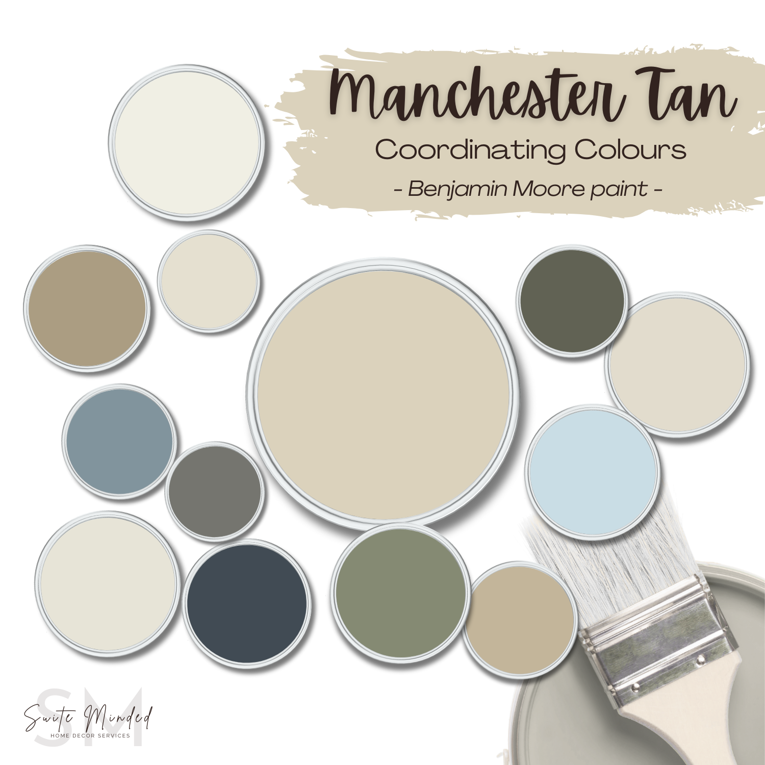
What are the best coordinating colours with Manchester Tan?

Manchester Tan is a beautifully versatile tan that pairs well with a wide range of colours, from soft neutrals to rich accent shades. Here are some of the best coordinating colours to use: Manchester Tan pairs beautifully with muted olive greens, blue-greys, dark greys, and warm whites.
For a layered, monochromatic look, consider a lighter or deeper greige with similar green undertones such as Edgecomb Gray HC-173 or Grant Beige HC-83.
For a richer, earthy contrast, consider Chelsea Gray HC-168 or Kendall Charcoal HC-166 to bring out the warmth of Manchester Tan while adding depth and character.
For a bolder contrast, consider a deep blue accent like Hale Navy HC-154 or Montpellier AF-555 to create a timeless, dramatic colour pairing.
For a nature-inspired look, look into a deep muted green like Dark Olive 2140-30 or Mohegan Sage 2138-30.
For a crisp yet warm contrast, consider a soft white like White Dove OC-17 or Cloud White OC-130 in adjacent rooms.
——————
Manchester Tan by Benjamin Moore is a timeless, warm neutral with a subtle green undertone. Whether you’re using it for living rooms, bedrooms, kitchens, or even exteriors, this cosy tan creates a welcoming and sophisticated atmosphere.
If you’re drawn to Manchester Tan but aren’t sure if it’s the right colour for your home or how to pair it with the right trim colour, coordinating shades, or other elements in your home, I can help!
👉 Need expert guidance? My custom colour consulting services take the guesswork out of choosing the perfect palette for your space.
👉 Looking for a ready-made solution? Explore my whole-house colour palettes, thoughtfully curated to create a cohesive and harmonious home.
Thank you for reading and happy decorating,
Manon xx