Benjamin Moore Colour Of The Year 2025: Cinnamon Slate 2113-40

Photo via benjaminmoore.com
Every year, Benjamin Moore unveils its Colour of the Year, setting the tone for upcoming design trends. This year, they have selected Cinnamon Slate (2113-40)—a beautifully balanced mix of warm plum and velvety brown. This rich, inviting shade brings warmth, sophistication, and a modern edge to any space.
Whether you're looking to refresh a single room or add a touch of colour and personality to your home, Cinnamon Slate offers endless possibilities. In this post, we’ll discover more about this gorgeous tone, coordinating colours, undertones, and the best ways to incorporate it into your home. Let’s dive in!
What are the undertones of Cinnamon Slate?
Cinnamon Slate is a rich, grounding muted shade that blends deep plum tones with soft brown undertones giving it a slightly moody yet inviting feel. This beautiful colour feels both cosy and sophisticated, striking the perfect balance between earthy warmth and subtle elegance. Use it in any space as an overall wall colour for depth and character or as an accent tone for a touch of colour.
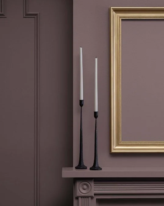
Photo via benjaminmoore.com
Cinnamon Slate’s LRV
LRV (or Light Reflectance Value) helps determine how much light is absorbed or reflected by a paint colour. It is measured on a scale from 0 to 100, 0 being absolute black and absorbing all light, and 100 being pure white and reflecting all light. The higher the LRV, the lighter and brighter the paint colour. The LRV of a paint colour is an important factor to consider, especially if you're concerned about brightness or creating a specific ambience. Colours with higher LRVs tend to make a room feel brighter and more spacious, while colours with lower LRVs can create a more intimate or cosy atmosphere.
Cinnamon Slate has an LRV of 19.71 which puts it on the darker side of the spectrum, meaning it absorbs more light than it reflects. This makes it a fantastic choice for creating a cosy, intimate atmosphere, whether as an accent wall, cabinetry colour, or even as a bold all-over wall colour in a well-lit room.
How does Cinnamon Slate look in different lighting conditions?
Lighting greatly impacts how a paint colour is perceived within a space, whether it be natural or artificial light. Natural light varies throughout the day making colours look slightly different in the morning and the evening, which is why it’s essential to use samples before fully committing to a paint colour so you can see how colours look at various times of the day and you can decide if a paint colour is the right one for your space.
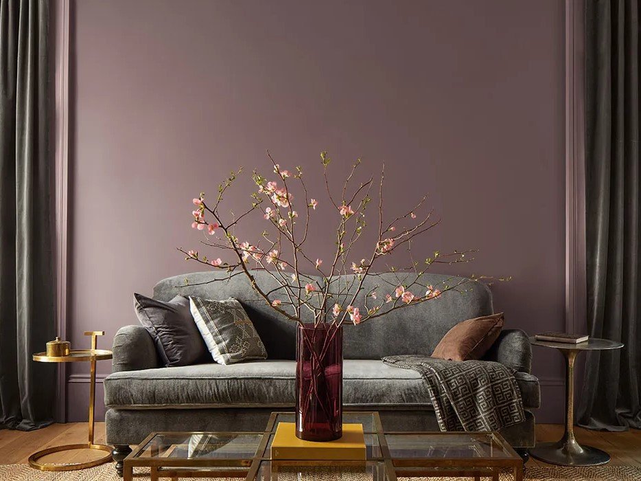
Photo via benjaminmoore.com
Cinnamon Slate is a gorgeous tone that can beautifully shift its appearance depending on lighting conditions and surrounding colours.
In north-facing rooms with cooler, indirect sunlight, Cinnamon Slate can lean more into its plum tones, giving it a slightly cooler, more muted appearance.
In south-facing rooms with warm, abundant natural light, the brown undertones emerge, making the colour feel richer and more grounded. It takes on a more welcoming warmth that enhances its cosiness.
In east-facing rooms that receive warm light in the morning and cooler afternoon shadows, Cinnamon Slate may look warmer and earthier in the morning, then shift towards a cooler, dusky plum tone as the day goes on.
In west-facing rooms that receive cooler morning light and warm, golden light in the afternoon, this shade can feel subtly muted earlier in the day and then dramatically warmer and more enveloping by the evening.
Where to best use it in the house?
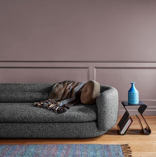
Photo via benjaminmoore.com
In a living room, Cinnamon Slate can create a warm, inviting atmosphere. It works beautifully as a feature wall behind a sofa or built-in shelving and can be layered with natural textures like linen, wool, and wood to enhance its organic feel.
Cinnamon Slate is also an excellent choice for dining rooms, especially if you want to create a dramatic yet sophisticated ambience. It works beautifully with statement lighting such as brass or glass chandeliers, and rich wooden furniture for a touch of refined elegance.
For those looking to add depth to their kitchen, Cinnamon Slate is a bold yet elegant option for cabinetry or islands, especially against lighter countertops and backsplashes for a beautiful contrast.

Photo via benjaminmoore.com
To make your bedroom feel both cosy and elegant, use Cinnamon Slate on all walls for an enveloping effect or as an accent wall behind the bed. It pairs well with soft, plush textiles like velvet or boucle, creating a space that feels tranquil and intimate.
Entryways set the tone for a home, and Cinnamon Slate creates an impressive, welcoming atmosphere. Whether used on walls, wainscoting, or a front door, it feels sophisticated and grounded.
Which white is Cinnamon Slate best paired with?

The right white paint colour can make this beautiful plum tone shine and come to life. Opt for a crisp white like Chantilly Lace OC-65 or Simply White OC-117 for a clean contrast and a modern look, and make Cinnamon Slate stand out boldly. For a softer, more seamless and cosy aesthetic, consider a warmer white such as White Dove OC-17, Swiss Coffe OC-45, or Cloud White OC-130.
What about coordinating colours?
To create a cohesive and well-balanced colour palette, you’ll want to pair Cinnamon Slate with shades that enhance its warmth, depth, and elegance. Here are some coordinating colours I recommend:
Cinnamon Slate pairs well with soft, warm neutrals creating a cosy and refined atmosphere. Consider warm light greiges like Benjamin Moore Pale Oak OC-20, Edgecomb Gray HC-173, or Revere Pewter HC-172, a soft creamy beige like Muslin OC-12 to blend beautifully, or a deeper beige such as Shaker Beige HC-45 to complement Cinnamon Slate’s undertones.
If you love rich, moody spaces, pairing Cinnamon Slate with deep, dramatic hues can create a sophisticated and layered effect. Consider a warm dark grey like Kendall Charcoal HC-166 or a deep green like Hunter Green 2041-10 to add a rich, nature-inspired contrast.
Cinnamon Slate also pairs beautifully with muted greens and blues to create a relaxed and elegant aesthetic. Consider a soft muted green like Benjamin Moore Saybrook Sage HC-114 for an organic and grounding feel, a green-grey blend suck as Carolina Gull 2138-40 for a cool contrast, or a deep navy like Hale Navy HC-154 to create a classic contrast.

—————
Benjamin Moore’s Cinnamon Slate 2113-40 is a warm, sophisticated, and deeply rich hue that effortlessly blends earthy comfort with refined elegance. It’s a colour that adds depth, character, and a touch of timeless charm, making it a standout choice for anyone looking to refresh their home with a sophisticated yet inviting palette.
If you’re looking for expert guidance in choosing the perfect colour palette for your home, check out my digital whole-house colour palettes, carefully curated to ensure a cohesive and stylish look throughout your space. Need something more tailored? My custom colour consultation services can help you find the perfect hues that match your style, lighting, and existing finishes.
Are you ready to bring Cinnamon Slate into your home? Let me know in the comments how you’d use this stunning shade in your space!
Thank you for reading and happy decorating,
Manon xx